")


Intro “The Makassarplein forms another central point for the neighbourhood. A square that could grow into the neighbourhood's living room. Its execution, while simple and functional, enables more social coherence, engagement, and safety. And it is sorely needed.” says district alderman Nevin Özütokof Amsterdam East.
Body The Indies District in Amsterdam East dates from the early 20th century. The streets are named afterislands in the former colony, The Dutch East Indies. The Indies District is highly diverse, both ethnical and linguistic. More than 100 languages are spoken there. From all of Amsterdam's districts it has the largest number of subsidized rentals that will be converted into owner occupied houses and flats. The upgrading is also evident from the recent opening of a hip youth hostel, a promenade with cafés and terraces, a conference centre, and a Mediterranean style shopping boulevard.
In the upgrading of the neighbourhood the development of the Makassarplein lagged behind.This plein or squarewas concealed by surrounding housing. A large part of it has been an anonymous stone surface. Its atmosphere changed with the time of day. Children and mothers occupied it during the day, and loiterers in the evening. In 2012 residents were involved in a round of discussions about its future. They were looking for more visibility and openness. Their wish list included a square centre, like a fountain. And with that we get to the essence of the matter. Residents wanted more opportunities to meet and connect with each other. More facilities for play and recreation, picnic tables, a terrace, and places to sit and rest.
Amsterdam’s ambitions and the wishes of the residentsmerge in a green and intimate setting. Use of up to 55% adjustable lightly reduces power consumption and increases the perception of safety. The demand for green with more experiential and useful values leads tomodest planters with grasses and perennials. Fruit trees provide shade around thepicnic tables. Courts and a play area’s give the squarenew energy, in both literal and figurative way .
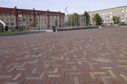
Brick paving was chosen for the qualitative functional upgrade. A mix of ’dikformaat’ Ruston andAuraton was selected. Ruston (red and purple) refers to authentic and natural. Auraton (yellow, red and brown) is moreconvivial and playful. This is what the square was intended to reflect in its new layout. Furthermore, the colour palette of the paving fits quite nicely with the existing urban context.


